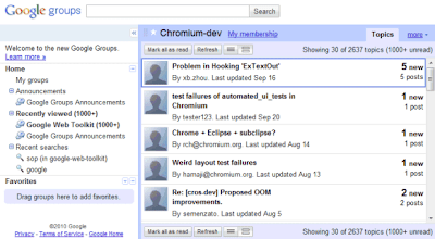
Google Groups tests a new interface that seems to be inspired by Google Reader. There are a lot of great new features: keyboard shortcuts, infinite scrolling, search box autocomplete, a mobile version, integration with Google Profiles and a rich text editor for composing messages.
The new version of Google Groups hasn't replaced the old version because it's not finished and there are still many issues to solve. The right sidebar shows a lot of uninteresting information (announcements, recent searches), but doesn't list your groups. You need to click on "my groups" to see this list and you can also add some of the groups to your favorites. Another issue is that the new interface no longer has a summary view that shows a small snippet from the first message of a thread.

"When you sign in to Google Groups, you'll see a link to preview the new Google Groups. Once there, you can make it your default view (and you can switch back to the old version if you ever need it). We're excited about sharing these improvements with you, but this is just a start; we're working on improved spam controls, moderation, search, and other freatures to make Google Groups the best way to engage in discussions. We also want to hear your thoughts, ideas, and any issues you encounter, so please contribute to our Product Ideas page," suggests Google.

Aucun commentaire:
Enregistrer un commentaire